Electrical Engineering
electrical_engineering.RmdVoltage amplifier output measurement
Read in data:
d <- read_csv("data/boexle_sorter_output.csv", show_col_types = FALSE)
d
#> # A tibble: 40 × 5
#>    channel frequency input_vpp output_vpp output_dc_average
#>      <dbl>     <dbl>     <dbl>      <dbl>             <dbl>
#>  1       2        50       2.5       130.             -0.13
#>  2       2        50       5         260.             -0.08
#>  3       2        50       7.5       389.              0.21
#>  4       2        50      10         518.              0.33
#>  5       2        50      12.5       646.              0.35
#>  6       2       500       2.5       130.             -0.22
#>  7       2       500       5         259.             -0.18
#>  8       2       500       7.5       389.              0.12
#>  9       2       500      10         518.              0.23
#> 10       2       500      12.5       646.              0.21
#> # … with 30 more rows
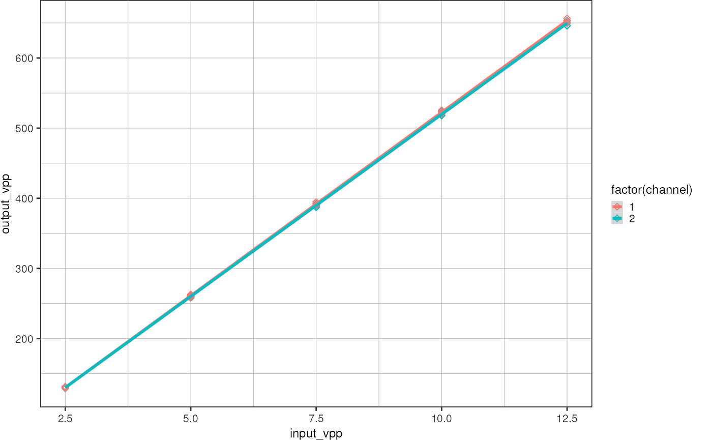
Plot:
ggplot(d, aes(x = input_vpp, y = output_vpp, color = factor(channel))) +
  geom_point(shape = 23) +
  geom_smooth(method = "lm", formula = "y ~ x") +
  theme_pretty()
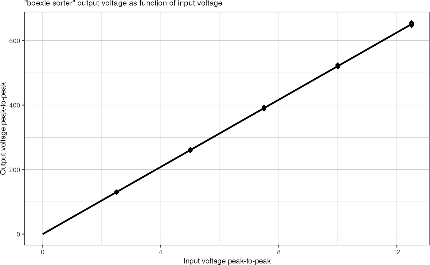
It seems like variables frequency and channel do not contribute significantly to the output voltage, therefore I am just fitting a single line through all the data points assuming a linear dependency “output voltage ~ input voltage”.
p <- ggplot(d, aes(x = input_vpp, y = output_vpp)) +
  geom_point(shape = 23) +
  geom_smooth(method = "lm", formula = "y ~ x", fullrange = TRUE, color = "black", linewidth = 1) +
  xlim(c(0, 12.5)) +
  labs(title = '"boexle sorter" output voltage as function of input voltage',
       x = "Input voltage peak-to-peak",
       y = "Output voltage peak-to-peak") +
  theme_pretty()
p
Prepare a plot that can be printed on A5:
p +
  scale_y_continuous(breaks = seq(0, 700, 100), minor_breaks = seq(0, 700, 25)) +
  scale_x_continuous(breaks = seq(0, 12, 2), minor_breaks = seq(0, 13), limits = c(0, 13))
Calculate linear regression manually:
lm(output_vpp ~ input_vpp, d)
#>
#> Call:
#> lm(formula = output_vpp ~ input_vpp, data = d)
#>
#> Coefficients:
#> (Intercept)    input_vpp
#>    -0.04027     52.08425
The amplifier gain is therefore 52x.